Here is as far as I have got:

There is still quite bit of stitching to go and I haven't placed any of the circles yet.
I am having second thoughts about the vase fabric!! It doesn't look right to me! I am not sure if I want to change the whole thing or just the appliqued parts.
Here are a few shots with possible replacement fabrics:


Would anyone like to offer an opinion??
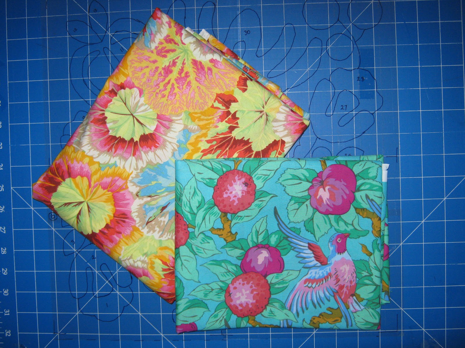
The 2 favourite fabrics I referred to in my last post are these:
My stem fabric is from Lecien and is a dark chocolate brown with a tiny mint green spot.
The "Oh no" refers to my elbow. I have tennis elbow, so I need to rest my right arm. No sewing!!! :( ...for a week!!!!!
At least I can type and use my mouse with my left hand....even if it is slowly!
Opinions? Okay. They are all pretty fabrics but I really like the balance the red fabric provides your block.
ReplyDeleteThank you for continuing to share your progress. It inspires me to get my Flower Garden started.
My choice would be the 5th one. The last one on offer. Look forward to see what you decide.
ReplyDeleteOf your choices, my favorite would likely be the red, but I am the queen of indecision (thus why I am so slow to finish anything). Tomorrow I will likely choose differently, but tonight I am wondering what a lavender/purple colored fabric would look like with your block--if you have one to try....and don't mind the color.
ReplyDeleteI think it looks fine but if I were to change it would be the 4th one down.
ReplyDeleteTrouble with us quilters of today we have too much choice!
I like either the turquoise with the bird or the red fabric Miriam - your block is look great :D I sympathise with your elbow troubles - I suffer golfer's elbow on and off and have been having a little break from hand sewing this week too.
ReplyDeleteYour block look greate ! And I'm sorry for your elbow.....No sewing for a week.....thats sounds terrible! I love the turguoise fabrick....with the bird!
ReplyDeleteI love your blocks, I would choose the 4th one down, it looks lovely, yet does not over power the entire block. I LOVE those fabrics, I'm working on a similar quilt with Kaffee Fabrics, they are all beautiful !
ReplyDeleteWendy
Sorry about your elbow. Do take care and rest up.
ReplyDeleteThis is a gorgeous block. Loveeee itttt!!! If I were to choose I guess I'd vote for #5 but they're all lovely so I guess really, take me with a grain of salt.
Actually I loved the blue one until I noticed that it's too close to the blue in the flower. I think I would go with the 4th one :0)
ReplyDeleteCrispy
With the plain reverse applique on the print, the print gets lost. I think I would go with the red solid and reverse applique a smaller print. The block is beautiful - so much to look at!
ReplyDeleteI like the 2nd and the 3rd choices (turquoise and red) the other fabrics seem to have too much going on and compete with the flowers in the vase, it's a lovely block.
ReplyDeletePersonally, if this was my block i would leave the pot there is nothing wrong with it.....Im upto block 8 and was indesive about my colour choices, so in the end i just left my blocks the way they are it doesn't matter about the fabric choices the quilt is so so busy and so colourful best bet is just to leave it.But if you really really have to change the pot i would go for fabric 4, fabric 5 has very similar colour choices to the fabric on the leaf and the flower on the righthand side it just look wrong.
ReplyDeleteYour progressing so fast with your block. I like the red fabric but I've never worked with the rich vibrant fabrics like you are before. I'm such a plain person. I really like the style of this block.
ReplyDeleteI really like the red/pink, more "solid" looking fabric. You have so many prints and colors going on, the vase gets lost...
ReplyDeleteI love Kaffe's fabrics, and Mably, Philips, etc. all work with him to produce these great fabrics! I am doing Roseville, but slowly...I am doing my fifth block right now. Love seeing your progress.
I like the red or the bottom one for the vase. Your block looks fantastic! I hope your arm gets better soon.
ReplyDeleteI love the colors you're using, and your fussy cuts are wonderful! That being said, I think the shape of the urn gets lost a little with the large scale prints? You want your reverse applique to show up well too, since it's a nice detail. In this block I think the ones I like best have a smaller scale print for the urn(almost read as solid from a distance) and a good contrast for those rev-A bits? Your block is so happy looking, like the flowers are dancing. :)
ReplyDeleteI like the blue one the best.
ReplyDeleteI have tennis elbow too and have now had it for 3 years. Not to get you depressed but you really need to rest it so it can get better. I wear a tennis elbow strap all the time. Cortisone shots don't work for me anymore. Take care of your self please.
Wow! I really love that you linked up to BOMs AWAY because I just love this project. You have some great fabrics! I really like the bottom two choices if you switch out the vase. They both have wonderful color and movement that complements the block without competing with the awesome flowers themselves. The red works nicely, too.
ReplyDeleteHow is your elbow doing?? Such a small spot can cause so much pain! Euhhh .... the last one I think, the green will be appliqued on top of it?? Love this project!! Hope you can stitch soon! Take care, hugs, Daniëlle
ReplyDeleteI like the red the best, and also the turq. I think the large scale prints get too confusing with the blooms - too much competition. I'm a little confused with the solid topper on the vase as you have it, since the scale of the print is so large, it gets kind of lost too. I think you want to focus on the flowers, yours are so beautiful!
ReplyDeleteStunning work Miriam! Lovely to meet you on Friday
ReplyDeleteCheers
Jo
I like the red or the bottom one for the vase. Your block looks fantastic!
ReplyDeleteall were so pretty
Gifts to pakistan
Beautiful work Miriam, it was good to meet you on friday>
ReplyDeleteI actually like the original, and it's already sewn, lol, but I also like the 4th one.
ReplyDelete